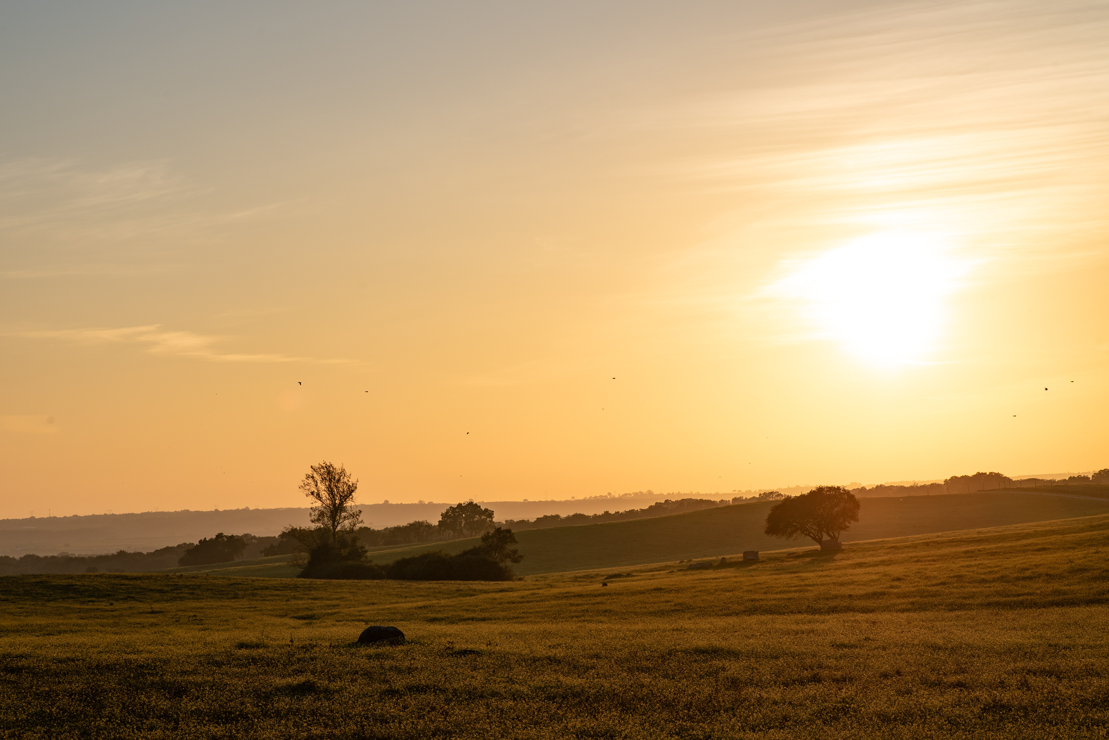
West, Crows were flying over, heading north back to their nesting trees.
Like the body, frequent exercise can strengthen and develop the spirit. Just as the body, if neglected, grows weaker and finally impotent, so does our nature perish if unattended. For this reason, the artist must know the starting point for the exercise of his spirit.
The starting point for this story is the study of color and its effects on the human being.
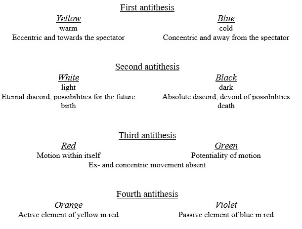
Two great divisions of color occur at the outset: into warm and cold, and into light and dark. So each color has one of four shades of appeal — warm and light or warm and dark; cold and light or cold and dark.
Generally speaking, warm or cold in color means an approach respectively to yellow or blue, which we will define as the first antithesis. This fundamental appeal confronts a more material with a more non-material quality. Both these colors induce a horizontal movement, the warm colors moving towards the spectator, the cold ones retreating from him. The motion also has rotation, eccentric for the yellow and concentric for the blue color. Yellow over-spreads its boundaries, so the movement of approach to the spectator can be increased by its intensification.
This first antithesis of colors, provoking movements in opposite directions, acts with a violent separative force. For the human inner appeal, the inclination of a color to yellow or blue is of tremendous importance. The movement of the yellow has a material parallel in the human energy to assess obstacles unthinkingly as the color projects itself aimlessly. Intense yellow is the color of the power of the sun. A steady gaze at a yellow geometrical form has a disturbing influence on the spectator, revealing an aggressive character for this color.
The second antithesis is between white and black. That is to say, the inclination of the color pair yellow and blue to light or dark. More or less light adds rigidity to the horizontal movement. The emphasis is achieved when adding white to the yellow, making it lighter, and by adding black to the blue, making it darker. From this relation, it becomes apparent that there can never be a dark-colored yellow (it’s replaced by brown), yet blue can be so dark as to border on black. The relationship between white and yellow is as close as that between black and blue.
The inclination of blue to depth makes its inner appeal stronger in these dark shades. When it rises towards white, its appeal grows weaker. In music light blue is like a flute, a darker blue is a cello. Growing darker is represented by the sound of a double bass and the darkest blue of all is the music of a pipe organ.
An attempt to make a yellow colder produces a greenish tint where the horizontal and eccentric movement is lost. Mixing blue and yellow results in green, which is the most stationary color. The blue, by its contrary movement acts as a break on yellow and is also hindered on its concentric spin. The calming induced by green may be beneficial, but after a time, it becomes wearisome. In the hierarchy of colors, green is the bourgeoisie — self-satisfied, immovable, narrow. In music, absolute green is represented by a violin's placid, middle notes.
Similarly, a mixture of black and white produces gray, which is motionless and spiritually very similar to green. The difference is that while the color green has the yellow and blue potentially active, only temporarily hindered in their movement, in gray, there is no possibility of movement. Gray consists of two colors with no active force: white is in discord with motion, and black negates it.
East — South — North
Black and white have been discussed in general terms of light and darkness. Particularly, white, often considered a noncolor, symbolizes a world where all color has disappeared. In music, it’s the pauses used to break temporarily the melody. However, it is not a dead silence, but one pregnant with possibilities. White has the inner appeal of the nothingness that is before birth.
A dead silence, a silence with no possibilities, has the inner harmony of black. In music, it is represented by one of those profound and final pauses, after which any continuation of the melody seems the dawn of a new world. The motionless black is the silence of death. Outwardly, black is the color with less harmony of all, a neutral background against which all other colors stand forward. The opposite occurs with colors against white: vermillion loses strength and light yellow appears weak. Against black, they gain warmness and brilliance.
The third antithesis compares to the first as being of the spiritually extinguished. It is comprised of green, a color already explained, and how it complements red.
The unbounded warmth of red has not the irresponsible appeal of yellow. This color glows inwardly, and maturely, and does not project its vigor aimlessly. It is a color with varied powers whose fundamental tone can be made warm or cold. Although this color reaches out less to the spectator, light warm red has certain similarities with medium yellow and gives a feeling of determination and strength. It is the sound of trumpets in music, strong and ringing. As the glow of red is within itself it is a color more beloved than yellow. In the open fields of green, the presence of red poppies is beautiful and of great harmony. A deep red, in comparison to a deep blue, still has a hint of renewed vigor, like waiting for the correct moment for a sudden burst. It compares to the sad notes of the middle tones of a cello in music. A cold, light red contains a distinctly material element like the singing notes of a violin.

West — West — North
Warm red, intensified by a suitable yellow, is orange. This brings us to the fourth antithesis, the contrast between orange and violet. Orange is the active element of the yellow in red. Violet is the passive element of the blue in red.
Orange comes to the point of almost spreading out to the spectator, but the element of red pulls to keep the motion within itself. Orange compares to a human being when convinced of its powers. In opposition, violet is red withdrawn from its humanity by blue. For this, the element of red must be cold, as the spiritual does not allow a mixture of warm red and cold blue. In wearing, violet is a sign of mourning in some countries. Like in the third antithesis between red and green, orange and violet are also complementary colors.

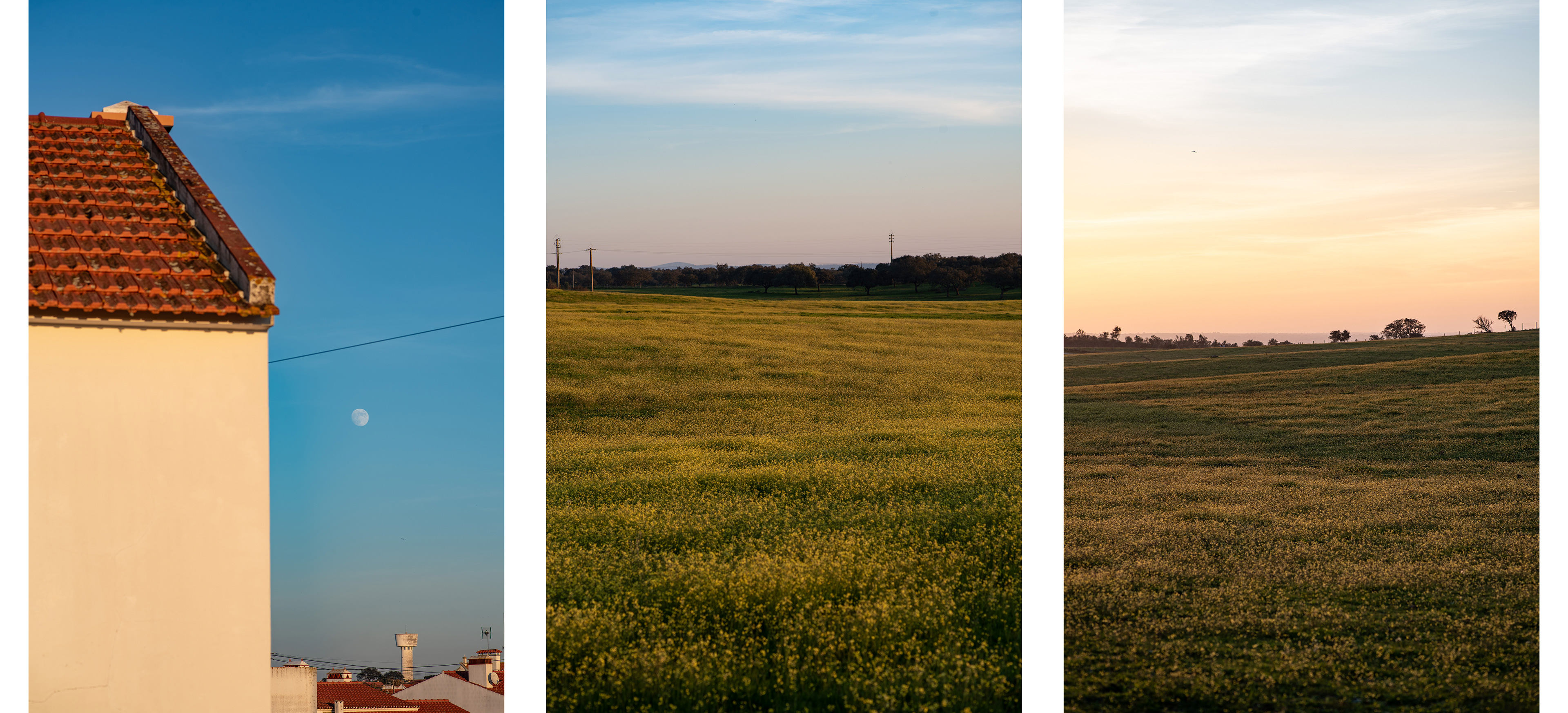
North — North — East (with golden moon)
Summary of the theory of color
This sharply defined working of colors by Kandinsky is the basis on which various values can be built upon harmony. How a color can carry with it the feelings of the inner need of the artist, and how related tones bind together are the foundations of colored harmonies.
From the fact that we live in a time of questioning, experimentation, and contradiction, one concludes that a harmonization based on individual colors in our age is especially unsuitable. The conflict of colors, the sense of balance we have lost and the tottering principles, the great questions we need answering and the unexpected assaults on one’s freedom, the reality broken by contradictions, these make up the current world’s harmony.
Color and form, each with its separate existence, blend into a shared life by the force of the inner need. The harmony in both is, therefore, the first two guiding principles of the inner need. The result is what is known as composition. The theory of composition by Kandinsky is the subject of a future story.